# install.packages("pacman")
library(pacman)

p_load(
  ## Core
  tidyverse,

  ## Spatial data manipulation
  sf,

  ## Download data
  mapSpain, rnaturalearth,

  ## Visualization
  RColorBrewer, ggspatial
)

# High resolution world map
remotes::install_github("ropensci/rnaturalearthhires")Choropleth map
R
spatial
ggplot2
Learn how to create a basic cloropleth map of Spanish population using {ggplot2}
1 Description
In this exercise, we will create two choropleth maps using {ggplot2}:
Map of Spanish population by municipality
Map of men/women ratio in Spain by municipality
2 Watch the video
3 Load packages
We will use the following packages:
First, I use {pacman} to load all the packages. Then, I use the {tidyverse} as the core package for data manipulation and visualization. The package {sf} will be used to treat the vectorial data. The package {mapSpain} provide functions to download the administrative boundaries of Spain (click here for further information). The {rnaturalearth} is a package that will provide us with the world map. However, for using the high resolution map we need also to install {rnturalearthhires} from GitHub. Finally, I will use the {RColorBrewer} package for colour palettes, and the {ggspatial} to add the map scale and north arrow. So, let’s dive into the exercise!
4 Prepare the data
The first step, is to download the world countries map using the ne_countries() function. This will return the map we see in Figure 1.
# World countries
world_sf <- ne_countries(
  scale       = 10,
  returnclass = "sf"
)
plot(world_sf["region_un"], main = "World Map")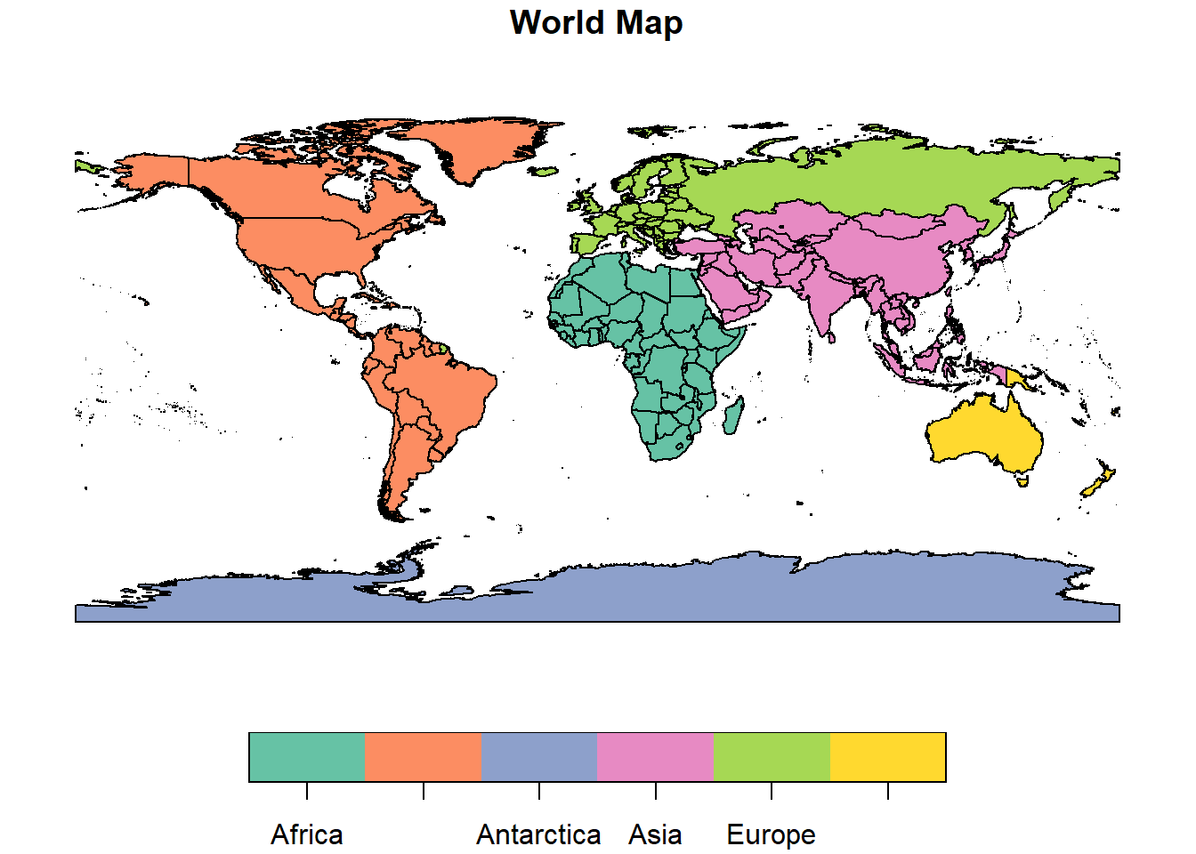
Next, we can get the Spanish population by municipality in 2019 using the {mapSpain} package:
# Get Spanish population by municipality in 2019
spain_pop_tbl <- mapSpain::pobmun19

head(spain_pop_tbl)
cpro provincia cmun name pob19 men women
1 02 Albacete 001 Abengibre 790 379 411
2 02 Albacete 002 Alatoz 519 291 228
3 02 Albacete 003 Albacete 173329 84687 88642
4 02 Albacete 004 Albatana 692 356 336
5 02 Albacete 005 Alborea 658 337 321
6 02 Albacete 006 Alcadozo 654 363 291This is a data frame with the data we want to plot. However, we need to assign this data to a spatial object with the municipalities. We can get the sf object using the function esp_get_munic:
# Get Spain boundaries by municipality
spain_sf <- esp_get_munic()

head(spain_sf)
Simple feature collection with 6 features and 7 fields
Geometry type: POLYGON
Dimension: XY
Bounding box: xmin: -3.14019 ymin: 36.73845 xmax: -2.05701 ymax: 37.54576
Geodetic CRS: ETRS89
codauto ine.ccaa.name cpro ine.prov.name cmun name LAU_CODE
382 01 Andalucía 04 Almería 001 Abla 04001
379 01 Andalucía 04 Almería 002 Abrucena 04002
374 01 Andalucía 04 Almería 003 Adra 04003
375 01 Andalucía 04 Almería 004 Albánchez 04004
358 01 Andalucía 04 Almería 005 Alboloduy 04005
373 01 Andalucía 04 Almería 006 Albox 04006
geometry
382 POLYGON ((-2.77744 37.23836...
379 POLYGON ((-2.88984 37.09213...
374 POLYGON ((-2.93161 36.75079...
375 POLYGON ((-2.13138 37.29959...
358 POLYGON ((-2.70077 37.09674...
373 POLYGON ((-2.15335 37.54576...We see that the data frame spain_pop_tbl and the sf spain_sf share 3 variables:
cpro: province code
cmun: municipality code
name: name of the municipality
The next step is to join both tables together, so we have the data frame attributes in our spatial object. We can achieve this as follows:
# Join population to sf object
spain_pop_sf <- right_join(
  spain_sf,
  spain_pop_tbl,
  by = join_by(cpro, cmun)
)
Note that here I did not include the variable name for joining the dataset. There are two reasons:
- The name and cmun variables express exactly the same.
- The variable name have some misspellings between datasets creating some NA values.
Once this is clarified, we can begin with the maps.
5 Spanish population
We could plot the Spanish population as a continuous variable, however, this would not be the best approach since the distribution of the population is quite irregular, and there is a small number of cities with very high population. Therefore, we can create bins based on the quantiles:
# Define the breaks (bin edges) based on percentiles
breaks <- quantile(
  spain_pop_sf$pob19,
  probs = seq(0, 1, by = 0.1)
)

# Round to hundred, and keep unique values
breaks <- round(breaks, -2) %>% unique()
breaks[length(breaks)] <- breaks[length(breaks)] + 100

# Create bins
spain_pop_ready_sf <- spain_pop_sf %>%
  mutate(
    pop_bin = cut(pob19, breaks = breaks, dig.lab = 10)
  )

print(levels(spain_pop_ready_sf$pop_bin))
[1] "(0,100]" "(100,200]" "(200,300]" "(300,500]"
[5] "(500,900]" "(900,1700]" "(1700,3500]" "(3500,9200]"
[9] "(9200,3266200]"With the previous code we create the new variable called pop_bin which consists in a total of 9 bins representing similar amount of municipalities. Finally, we can represent it graphically with the next code:
# Plot the population
ggplot(spain_pop_ready_sf) +
  ## Geometries
  geom_sf(data = world_sf, fill = "grey90", color = "black") +
  geom_sf(aes(fill = pop_bin), color = NA) +
  ## Scales
  scale_fill_brewer(palette = "RdBu", na.translate = FALSE, direction = -1) +
  ## Labels
  labs(
    title   = "Spanish Population by Municipality",
    fill    = "Population",
    caption = "Author: Adrián Cidre González"
  ) +
  ## Coordinates
  coord_sf(xlim = st_bbox(spain_pop_ready_sf)[c(1,3)],
           ylim = st_bbox(spain_pop_ready_sf)[c(2,4)]) +
  ## Theme
  theme_bw() +
  theme(
    plot.title = element_text(hjust = 0.5, size = 16, face = "bold"),
    legend.background = element_rect(color = "black")
  ) +
  ## Ggspatial
  annotation_scale(location = "br") +
  annotation_north_arrow(location = "tr", which_north = "true")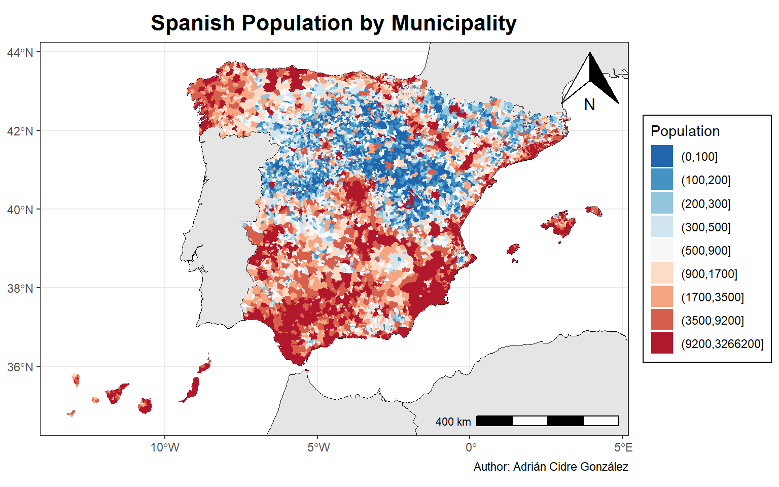
We see some patterns in the distribution of the Spanish population. The central-north area exhibits a clear lower population than others areas., whereas coastal areas and islands area highly populated.
6 Ratio Men/Women
I will now create a similar visualization, but displaying the ratio between men and women by municipality. First, I create the new column:
# Ratio men-women
spain_pop_ready_sf <- spain_pop_sf %>%
  mutate(ratio_mw = men/women)

summary(spain_pop_ready_sf$ratio_mw)
Min. 1st Qu. Median Mean 3rd Qu. Max.
0.3415 1.0003 1.0690 Inf 1.2067 Inf We can see in the summary before that the values between the minimum and the \(3^{rd}\) quantile exhibit normal values, but the maximum value is infinite. This is because in some municipality there are men, but not woman (i.e. division by zero). We can see also the boxplot:
boxplot(spain_pop_ready_sf$ratio_mw)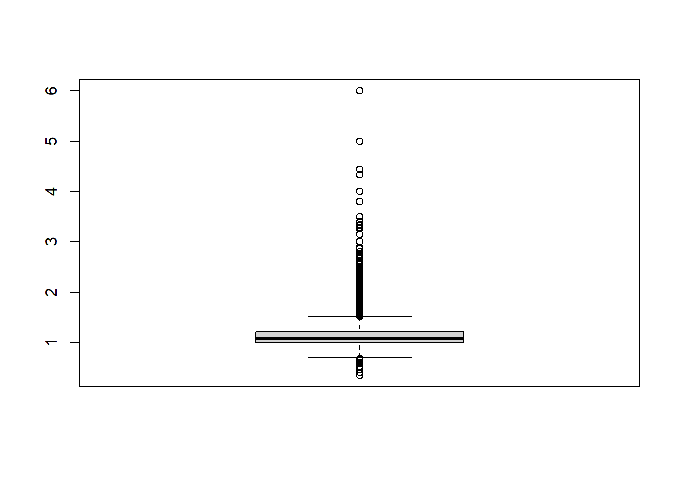
This tells us that a visualization of the continuous distribution will barely differentiate between area with higher women proportion (<1), and areas with higher men proportion (>1). Therefore, I apply the same approach creating bins:
# Define the breaks (bin edges) based on percentiles
breaks <- quantile(
  spain_pop_ready_sf$ratio_mw,
  probs = seq(0, 1, by = 0.1)
)

# Round to hundred, and keep unique values
breaks <- round(breaks, 2) %>% unique()

# Create bins
spain_pop_ready_sf <- spain_pop_ready_sf %>%
  mutate(
    ratio_bin = cut(ratio_mw, breaks = breaks)
  )

## Print bins
print(levels(spain_pop_ready_sf$ratio_bin))
[1] "(0.34,0.96]" "(0.96,0.99]" "(0.99,1.01]" "(1.01,1.04]" "(1.04,1.07]"
[6] "(1.07,1.11]" "(1.11,1.17]" "(1.17,1.26]" "(1.26,1.44]" "(1.44,Inf]" With this code, a total of 10 bins are generated with the ranges showed above. So let’s proceed to the visualization:
# Plot the population
ggplot(spain_pop_ready_sf) +
  ## Geometries
  geom_sf(data = world_sf, fill = "grey90", color = "black") +
  geom_sf(aes(fill = ratio_bin), color = NA) +
  ## Scales
  scale_fill_brewer(palette = "RdBu", na.translate = FALSE, direction = -1) +
  ## Labels
  labs(
    title   = "Men/Women ratio",
    fill    = "Ratio",
    caption = "Author: Adrián Cidre González"
  ) +
  ## Coordinates
  coord_sf(xlim = st_bbox(spain_pop_ready_sf)[c(1,3)],
           ylim = st_bbox(spain_pop_ready_sf)[c(2,4)]) +
  ## Theme
  theme_bw() +
  theme(
    plot.title = element_text(hjust = 0.5, size = 16, face = "bold"),
    legend.background = element_rect(color = "black")
  ) +
  ## Ggspatial
  annotation_scale(location = "br") +
  annotation_north_arrow(location = "tr", which_north = "true")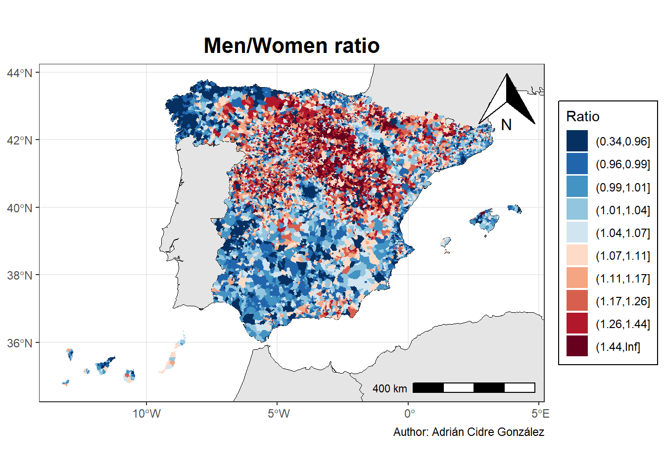
Curiously, we can see that the less populated areas are also populated mostly by men, whereas coastal areas and islands tend to be more balanced, or more populated by women.